Impulsion Images Case Study
Case Study | Impulsion Images from Megan on Vimeo.
Here's a three-minute description of the methods I used to plan a homepage for Impulsion Images.
The Challenge
Determine the best way to market Impulsion Images, an equine photographer.
Move visitors from the discovery phase (search engine, social media marketing) to the conversion phase.
Planning and Discovery
Users - Main Categories
Why use the product?
Becca, the owner, is the very best at taking fancy photos of you with your horse.
Primary motivators, passions, and goals?
Impulsion Images' ideal clients are horse enthusiasts who want posed photos and professional competition photos at dressage and other events.
Strategy
Experience, renown, and passion
Becca has been an equine photographer for [find out how many years] and her work has been on the cover of magazines like Young Rider and PHJ (Paint Horse Journal). She is passionate about horses and has an amazing eye for photography.
Tasks and Scenarios
What are primary tasks and scenarios that the design should support?
Mostly view portfolio and book a session. Collect payment? Information about event packages, what to expect for a session
Success Measures
How does the product make money?
Booking and completing photography sessions, obviously, but also increased social media following. We can offer gated downloads to get contact info, but that’s a level of marketing she may not be comfortable handling on her own later.
Research
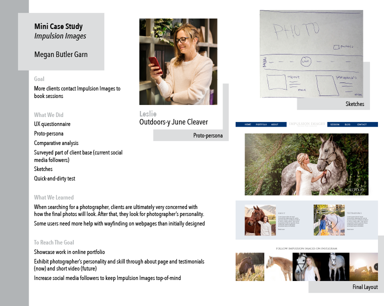
Proto Persona

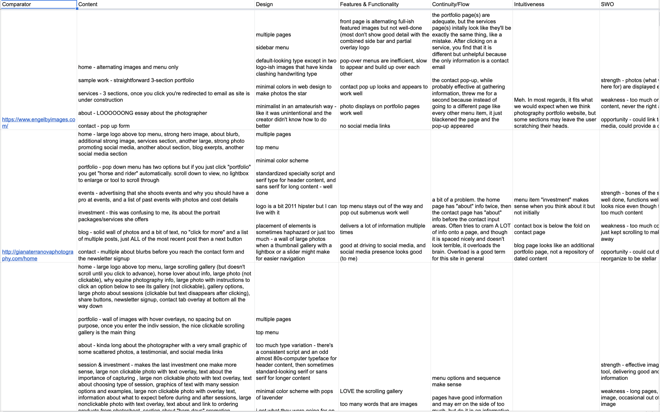
Comparative Analysis

Survey
Surveyed Impulsion Images' social media followers and got about 75 respondents. Results confirmed some suspicions and led to knowledge about new customer bases to explore.
Plenty of people mentioned (in free response areas!) that they’re looking for photographer’s personality (explicitly and using terms like comfort, communication, ability to direct, click [as in personality match], connection, easy to work with, friendly, genuine, inspiring confidence).
Design
Design Principles
Becca describes her ideal site as, “CLEAN, modern, simple to read and understand, light.”
Based on the comparative analysis, I agree that the look and feel she wants should lead to a successful site, but that’s surface.
What makes Impulsion Images unique among equine photographers is Becca - she’s an amazing photographer and the best to be photographed by and she’s shot a huge number of horse sessions and events.
I plan to express her personality through testimonials and her about info.
Final Design Principles:
puts [the user] at ease, skilled, and common interests

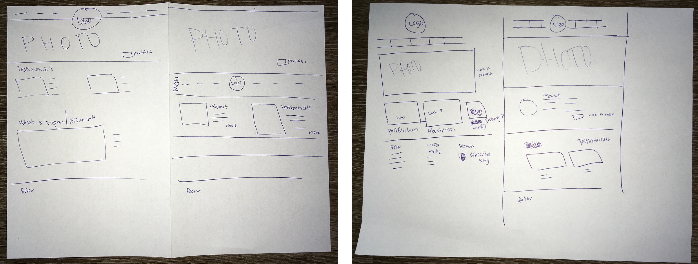
Sketches

Testing
Quick and Dirty Test
Presented one sketch to two potential users. Both were confident about reaching the portfolio page from the top menu, but only one thought to click the hero image to reach the portfolio page. I may add a button of some kind on top of or immediately below the hero image to further indicate that it is clickable.
The about and testimonials pages were evident for both testers from the menu and the subheading below the hero image.
Mini Case Study

